Friday, 9 July 2010

50 Cent DVD


How have they represented him? Looks low budget as they have just put the same image on the back and front and the fonts are very basic. They have tried to make him look like a gangster with his tattoos and shirtless body and chains. There is no publisher on the DVD and also there is only parental advisory and no age limit. It does include the DVD logo but it looks low quality as if it has been copied and pasted. The title of the DVD is just simply "50 CENT".
Despite that they have met all the dvd features, track list, titles, producers, its just very basic, and easy to understand. On the other hand there are no particular bonus features, or features that may influence you to buy the dvd, other than the expectation of high quality music videos.

Wednesday, 7 July 2010

Magazine article for JLS - Beat again

For our magazine article we would like to have a big picture of the group on the front cover. Also on the front cover we would like there to be little pieces of information which links in to the article to make the reader want to read on. We would have an article on the forming of the band as a group interview, this would consist of how the group came together, all the ups and downs and challenges we had to come through. Also interviews with individual members including a directors cut interview. we will have different pictures of the band chilling together on the set of their new video.
Comparison to other boy band articles

N-Sync are a boy band similar to JLS, but unlike us they do not have any pieces of info on the

Digipack Ideas

In our digipack we will include:
  • The music video - "Beat Again"
  • The music video with directors commentary
  • Behind the scenes footage of the making of the video
  • Interview with Joe Sorensen about the making of the video
  • Interview with the choreographer - Albert Linsdale
  • Alternative music video - "Beat Again"
On the front of out digipack will be the following picture:
We will have the title of the video across the front with reviews in quote marks also.


Examples of other boyband digipacks:

P3-14

P3-11

  1. Shot was held steady
  2. Frame a shot excluding and including elements
  3. used a variety of shot distances
  4. material shot was appropriate to task
  5. mise en scene selected appropriately
  6. Editting meaning was apparent to viewer
  • Fit with genre characteristics
  • visual lyrics
  • visual music
  • sold the artist
  • intertextuality
We thought it was entertaining, the lip singing at the beginning was clear and really good however due to brightness it was hard to see it later on.

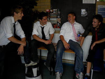
Still Photo's JLS Beat Again


Genre characteristics:

- As the song genre is Pop, we can see they have used typical boy band look/moves.
- They did casual dancing which is common in a pop video.
- They used different camera angle/shots such as high angle (on the stairs) long shot, mid shot, etc.

Visual/lyrics:

- There was some body language by jamie that matched the lyrics (When he said 'I' he pointed to himself) but no obvious visual with lyrics.

Visual/music:

- They did a change of location and person when the verse changed.

Need to sell the artist:

- They dressed smartly which is appealing to their target audience

Intertextuality:

- Hard to achieve in one location.

Voyeurism:

- The entertainment of dancing and them being well dressed is enjoying to watch.


Analysis

  • The music is mainstream pop.
  • Location is around college.
  • Change of location, typically in any music video.
  • There is a dance routine along with some solo singing.
  • Their hearts aren't literally not beating.
  • Their costumes don't change but suit the song & video.
Overall the video is well done, good editing and transitions.
Lip syncing is in time.
 
© 2009 12P3-14 - Intro To Music Video 10'. All Rights Reserved | Powered by Blogger
Design by psdvibe | Bloggerized By LawnyDesignz